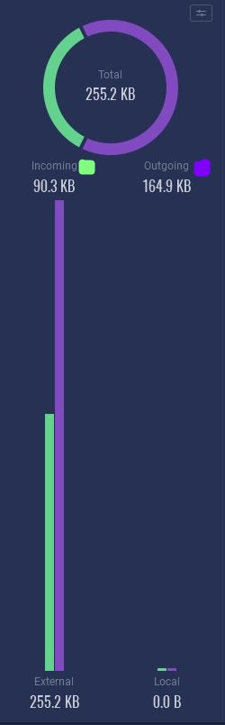
I would like to see a legend that would allow a user to quickly identify the incoming and outgoing data colors at the top of the Usage Tab bar graphs. It could be as simple as a swatch of the specific color representing the incoming or outgoing data, next to the words “Incoming” and “Outgoing.” Here is a pictorial sample of what I mean.
I may be misunderstanding, but if you look directly under the “Total” circle there are two small boxes and one says incoming and the other outgoing.
Hi Ken. Sorry about the ambiguity. I am suggesting that a swatch of the color that denotes the incoming data (in this case, green) and the outgoing data (in this case, purple) be placed next to its respective text labels, as I did in the attached image, next to the words "Incoming or “outgoing,” that are beneath the Total circle graph. In my opinion, that would allow a user to quickly see which color represents which data direction without having to think about it to figure it out, as I find myself having to do most of the time. I think that addition would slightly improve workflow, at least for me, and maybe others too.
1 Like
I think that is a good, simple idea that will improve readability.
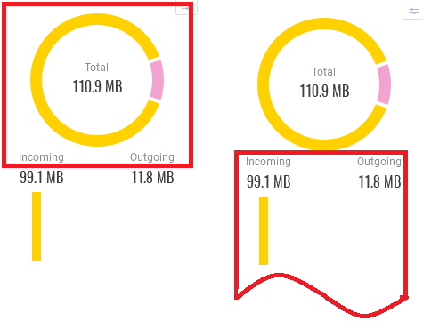
The incoming and outgoing labels don’t actually indicate what they apply to: the pie chart above or the column chart below. Adding the colors as a key would make it clearer, as would increasing the blank space between the two lines of text.
The red boxes indicate how the grouped elements might be interpreted. The left hand box is the current situation. The right hand box shows what I usually read the labels as, headings to two columns.
1 Like