Hi Glasswire creative team,
The Graph and Usage tabs have an issue in versions 3.x.
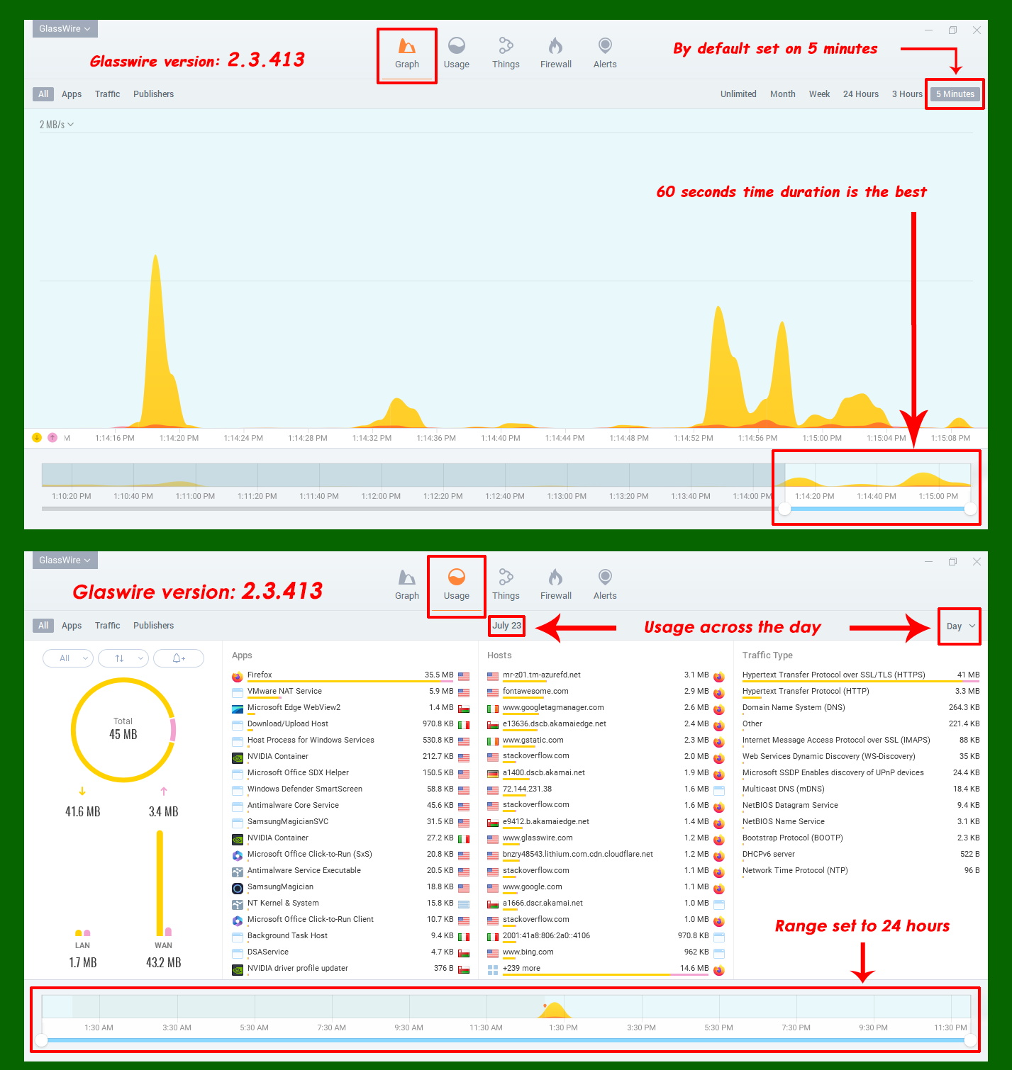
How should the Graph tab work?
It should show online throughput by default. It should act as a real-time chart to display bandwidth at any given moment. Therefore, I suggest setting the duration to “5 minutes” and reducing the range at the bottom of the page to the smallest option (1 minute).
How should the Usage tab work?
Unlike the Graph tab, it should show overall consumption at a glance, without fluctuating data (just fixed numbers). By default, it should display usage for a “1 Day” duration (24 hours).
See example for both: