The shortest time frame is “Day” I used to be able to see the last 1 minute, 3 minutes and 3 hours. Would also love to see last 24 hours for times when my connection is timed by the 24 hours.
Also, i don’t see where i go to reset my data (this also used to be a feature).
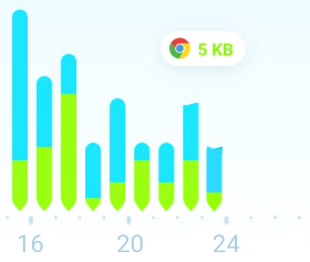
I also like seeing the curve, as opposed to a bar which combines many hours of stats. I need to see which apps are starting and how their data consumption compares to other apps and when it starts and stops.
Are these things hidden/moved? Please tell me where to find them, or bring them back pronto, the app is truly worse without them.
Yes, unfortunately Google has made the live graph impossible. Our Windows software has a live graph and this is what we’re all about! We’d always have a live graph if it was technically possible.
I can promise you this change was much more frustrating for us than you. It’s extremely upsetting to have to get rid of the live graph, but there is absolutely nothing we can do.
The good news is that the app is super light, super accurate, never gets killed, and the new firewall is rock solid. We added back kind of a real time feel with the bubbles feature, but the data it receives is going to be delayed a little depending on what phone type you have.
To reset your data you should tap the bottom middle icon and make a plan. You can then do whatever you want.
There is no clear history option because the new API we use to gather data comes from your phone. This data is already on your phone (it would be misleading for us to “clear” it), but for privacy reasons we show a trash can icon and no app name details when an app is uninstalled.
Unfortunately it’s a pity having to give up from live graphics. But in fact it looks like some kind of energy saving restrictions imposed by Android from version 10. I faced this issue in other app when I upgraded to Q, where instead of a live graph the application started to display one or two snapshots from time to time. Again, it was a hassle because I relied on that app to measure wifi signal strength and quality.
The solution you found, that bubble-like graphic, was an interesting way to get around the problem. Of course it doesn’t solve it, but for lack of better, it will have to be sufficient.
Another important issue is to maintain the app lightweight concerning battery consumption. I haven’t conclusive results yet, but for now GlassWire does not show up among the biggest battery consumers (under battery usage statistics).
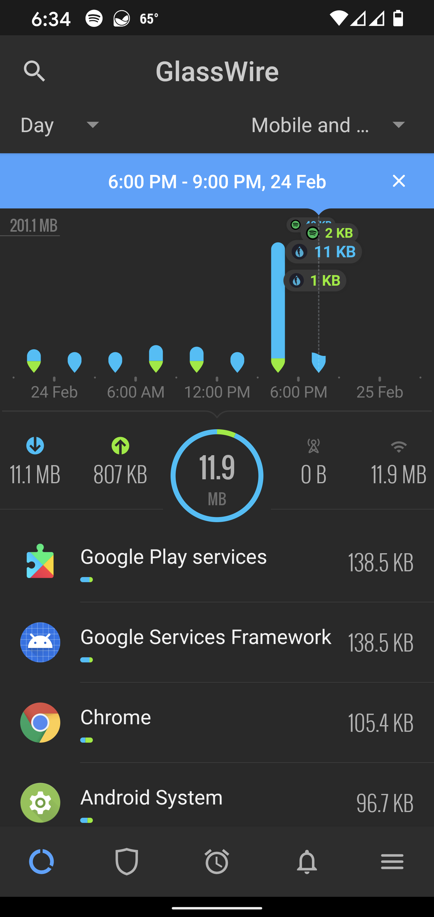
Well, I also missed the “5 minute”, “1 hour” frames, etc… But now if I select the “day” interval, I can see several vertical bars corresponding to a 3 hour period each. If I tap on any of those bars, a list is displayed below the graph showing the apps that accessed wifi and/or mobile data in that 3 hour frame.
Not the ideal solution, but if we think about energy consumption impact, it may be an acceptable compromise.
For me the battery consumption of any app is important due to the reduced capacity of my device battery.
LOL, I searched Google Play for “Wifi Analyzer” and there were like 10 apps with that exact name so I was too scared to install any of them. Maybe I’ll try it later with our testing device.
We have now released two bug fixes since this initial release. If anyone was having problems with the previous version please give the app a try again.