Graph:
1- Is there a way to get more information in terms of upload & download speed on the main graph screen, maybe a grid pattern and marked y axis with speed information?
2- Speed details at a certain point when you hover your mouse over a graph point, is that something supported or going to be supported at some point? I have seen this in one app but cannot remember it. Made a small demo to show what I am asking for:
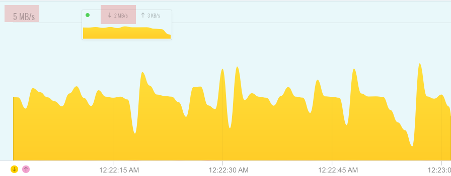
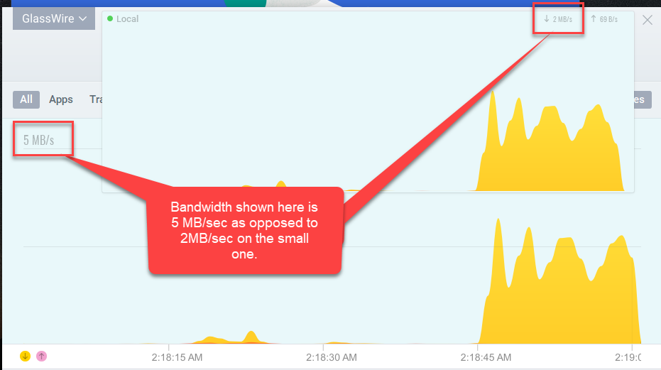
3- The speed on the main graph and mini one does not match? Can you kindly explain whats the difference between the two?
Firewall
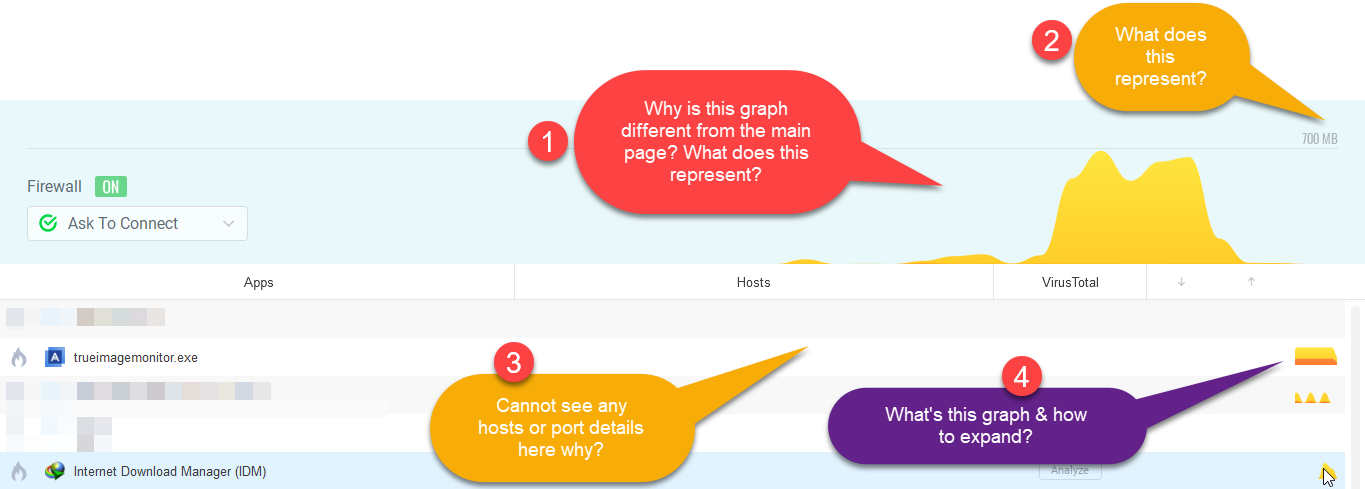
1- Why is the graph different on the firewall page then from main page?
2- Whats the usage shown on the firewall page?
3- Why are host details and port not shown for all applications?
4- What does the small graph represent and how to enlarge it and see the details?
Please find the image with all points marked for reference.
Thanks in advance for taking the time to explain.
Thanks for your questions.
GlassWire is a historical network monitor and more details are here: https://blog.glasswire.com/2016/05/09/understanding-glasswires-graph-and-scaling-how-much-data-are-you-using-on-your-pc/
Graph
-
We have a “speed meter” like this on our Android app notification, is that how you mean?
-
I am not sure I get it.
-
Drag the mini graph over the main graph so it’s exactly the same. If it’s wider/longer it will look different because of the size of the window. I have noticed this also.
Firewall
- It’s a different time interval.
- I don’t understand. For Usage it’s better to use our Usage tab.
- Because it’s not currently using the network. Go to our “Usage” tab to see historical details, or the graph.
- It’s just a general idea of that app’s network usage. You can use Usage/Graph for more details.
Hi Ken,
Thanks for taking the time to explain & appreciate the quick responses.
Graph:
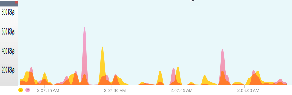
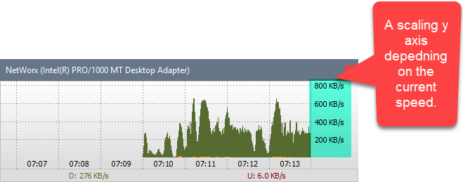
- Yes, but can we have more labeling on the y axis which is dynamic and valid for 5 minute interval. So for e.g. if the maximum speed in continuous 5 minute interval is 800KB/sec, the y axis show 200, 400, 600 & 800 so we can know estimate what other speed that the other peaks on the graph represents. A very rough depiction for this so you can get an idea what I mean:
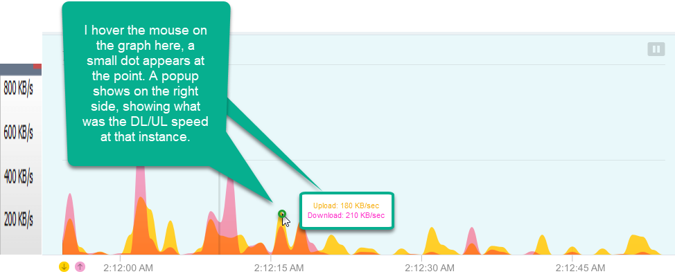
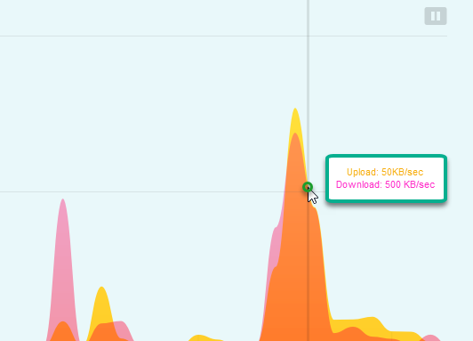
2- Let’s say in the graph below, I hover the mouse at some instance. It shows a small popup with DL & UL speed at that instance. I know if i click on the graph and it stops and shows how much data was downloaded & how much data was uploaded at that instance, but I requesting if we can see the download and upload speed as well without stopping the graph.A small rough depiction below:
3- I can understand the graph the look different because of scaling, however, my concern is with regards to bandwidth details. The main screen shows 5MB/sec where as small screen shows 2MB/sec. Why?
Firewall:
1- Ok different time interval makes sense. Just for reference, whats the default time interval of firewall graph?
2- On the image please look at point 2 in red, it says 700MB and it hasn’t changed for the last couple of hours. What is 700MB showing?
3- Clear, makes sense.
4- Clear, makes sense.