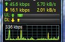
This is a minor complaint/suggestion. The network activity graph is cool. However, it isn’t really all that informative. In the GlassWire desktop app, you have two horizontal lines. The top one is labeled with a bandwidth number. It would be helpful if the other one is labeled as well.
Also, the mini graph is completely useless without any kind of understanding of bandwidth presented. I have seen it where there is one large peak, and the rest are really small. When the large peak disappears to the left, suddenly I have large numbers of large peaks. Without some understanding as to what these peaks mean, the graph is pointless.
I propose that you have a number in the upper right hand or left hand corner of the graphs (including the mini graph) indicating the upload and download bandwidth consumed at that moment as the graph indicates - only for the the extreme right hand side, not for all peaks. I used to have a desktop gadget that did that - very handy. This added functionality will make the graphs much more understandable and give context to their meaning.