-
Could the rows that show the date be of a vividly contrasting color from both the “Read” and the “Unread” alerts themselves to make it easier to find them, when scrolling through the list, to see where one day’s alerts end and the adjacent day’s alerts begin?
-
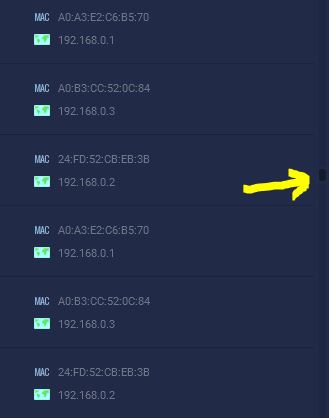
Could the scrollbar button also be of a vividly contrasting color to allow it to be more easily located within the scrollbar?
-
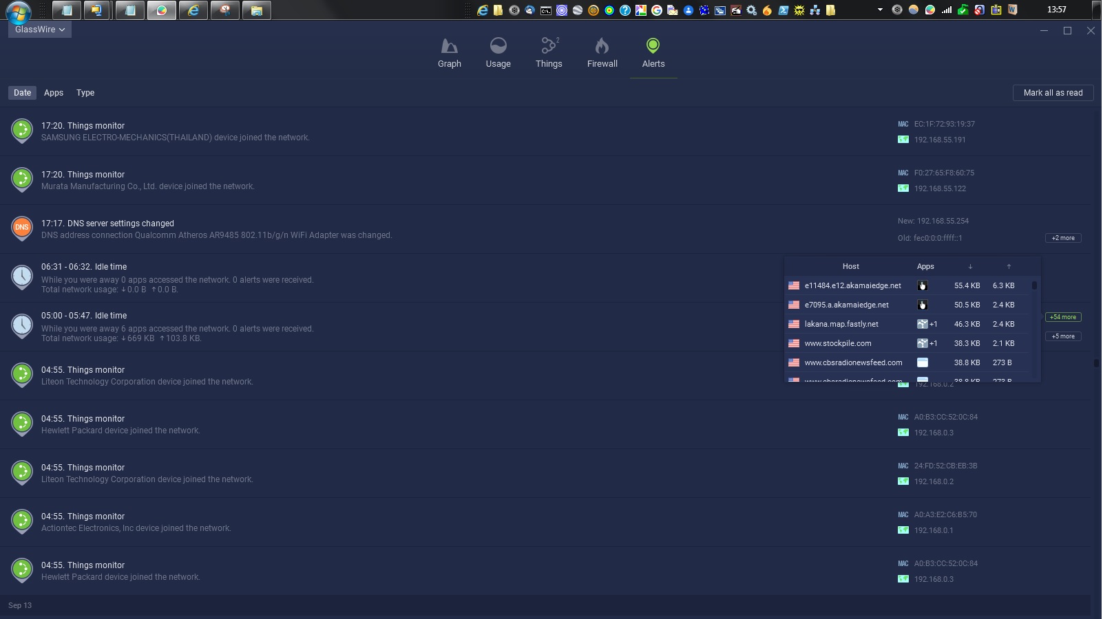
Could the DNS alerts’ “old” and “new” address detail items (located at the right side of the DNS alert row) also be of a more vividly contrasting color to let them be readable, similar to the “more detail” items that invoke a detail dialog box for hosts and apps on some of the other alerts?
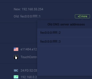
- Can the IP addresses listed in the Old and New detail dialog at the right side of a DNS alert also have a 3-dot button to allow further examination of the old and new DNS host servers’ information?
Thank you
dfg