So I’m trying to review what apps on my computer are doing.
Essentially, I focus on what communicates to the outside world.
The most important metric is the amount of data send outbound from the computer.
Looking at the application (Windows 10 - v3.3.501) this should be under Security, the column titled “Traffic Out”. The data in this column is wrong, however. It’s showing real-time amount of data per second which is also found under the nameless columns with simply arrows pointing up or down. Further confusing the matter, the two sets of columns show different results. So, pretty much all four columns are messed up. I suppose two might be correct, but it’s not possible for the user to tell which. This suggests Glasswire is doing one of two things. 1) They have “Agile” development practices where the programming teams are testing their own work or 2) No one is testing anything. The net result is poor quality.
Hi @Dougg,
Thanks for your feedback regarding the unclarity of columns on the GlassWire Protect tab.
Everything on the GlassWire Protect tab is regarding security.
To confirm, the “Traffic In” and “Traffic out” columns represent the anomaly detection feature. IT shows you the average in and out traffic per app and if it differs significantly from other users.
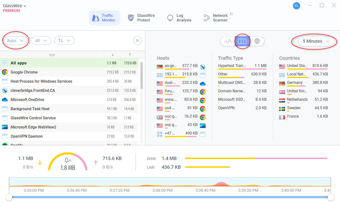
The metrc you are looking for, to monitor the amount of data to and from each app can be found on the “Traffic Monitor” Tab. There are multiple views: Graph, Table and World map.
In you specific case I suggest the table view, here you can filter by apps and set a time interval from 5 mins to unlimited.
Best,
Katie
1 Like