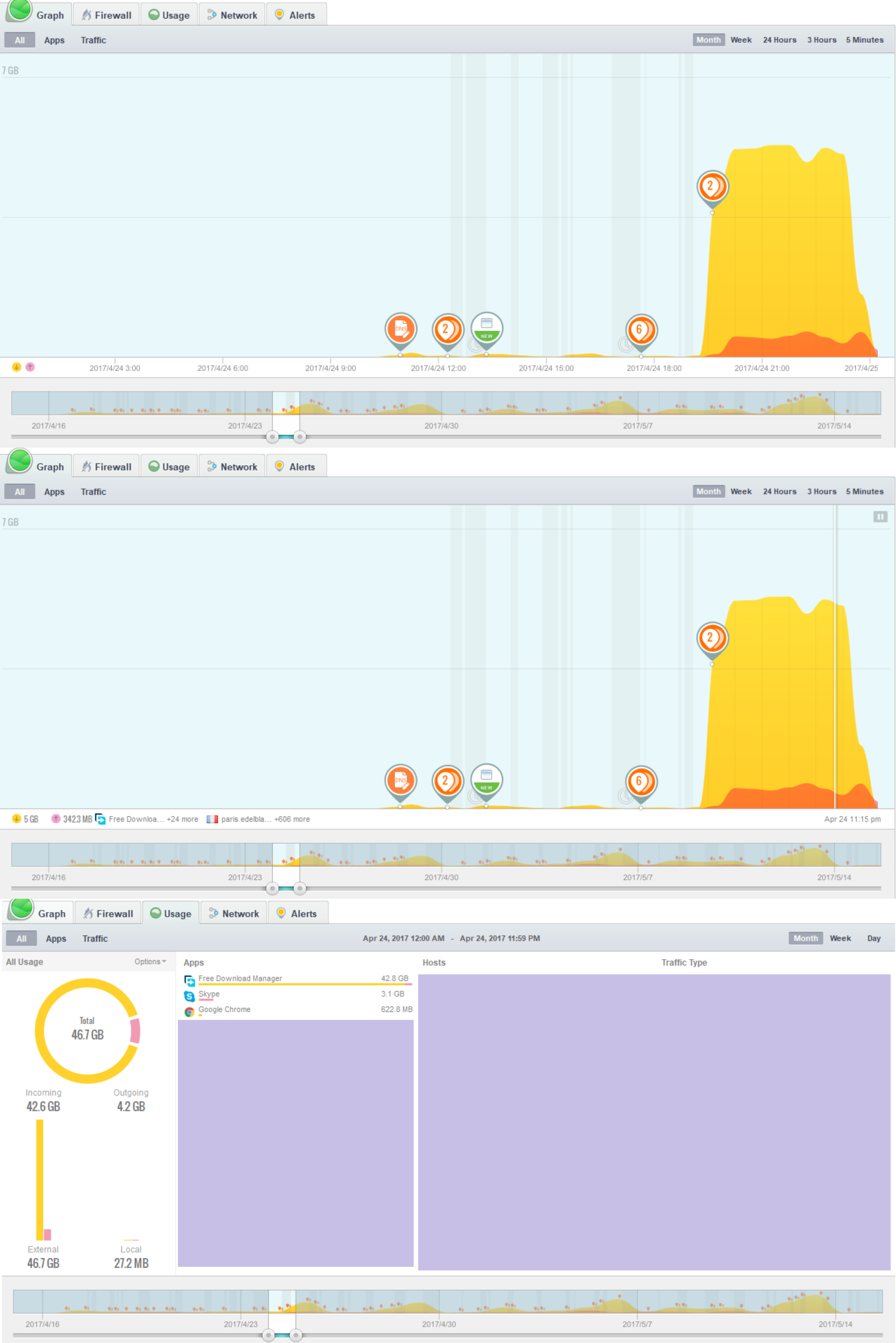
All 3 screenshots shows the time period of April 24.
My questions:
I can see from the last one that the total data that sent and received is 46.7GB, so what does the 7GB(in the upper left corner) means in screenshots 1 and 2?
What does the 5 GB(in the bottom left corner) mean in screenshot 2?
Graph view 1 shows All usage for the interval that you have selected for 24 April. It is peaking somewhere below the 7GB limit per graph period. The sum of bandwidth for each period on the graph should equal the Usage total of 46.7GB.
Graph view 2 shows the same All usage but you have clicked on the graph to select one period at 11.15pm on April 24. During this period, 5GB has been downloaded and 342.3MB has been uploaded by 25 processes to/from 607 hosts.
The Usage view shows All usage for April 24, the day you’ve selected, as 46.7GB = 42.6GB down and 4.2GB up. Rounding means that the two subtotals don’t add to the total.
Thank you for your reply!
The only stuff I can’t see is length of single period in long-term graph.
For example, how long is the period in your first answer(It is peaking somewhere below the 7GB limit per graph period) and the second one(During this period, 5GB)?
I have that problem too because they aren’t displayed directly. I’m expecting version 2.0 to fix this.
For the Graph tab with the Month view and one day selected then the periods are half hourly.
You can check this yourself. Click on the graph and then move to the left or right clicking until the time changes. The difference between the times tells you how the period for the displayed data.
We can not select a start and end point but only a ‘period’.
At the bottom timeline, we can not fine tune ‘graph resolution’ but are limited to pretty arbitrary minimum time lengths.
It looks really nice but is not useful at all when it tells me I had 123 GB of traffic but not when or over what time interval.
I did have an itch though, so I did an experiment! I went to ‘5 Minutes’ interval length, and found a peak that was very close to 1/4 the marked line, which said 2 MB/s. The number on the bottom left side said 185 KB.
Going by this, the length of the click-in-graph-interval @ 5 Minutes is roughly 185 KB x 4 / 2048 KB/s =0,36 seconds. Wow, science!
We expect users to dial down on usage info with our “usage” screen. Go to the top right of the usage screen, then choose the “Month” pull-down menu. Now choose “Custom” and you can break down traffic by day, week, etc… and see detailed host/app info.
We designed the graph to quickly see your network history in a graph view, but if you want to really break it down in detail it’s much easier to use our usage screen.
Meanwhile, for the graph we are working on a mode that show more of a sharp graph for people who need a more defined graphical accuracy.
Thank you for your reply. The custom view allows me to choose the time and day for which I want to see an analysis, however the granularity is doesnt allow for more than about 1-6 hours of time when following your steps. I cannot check usage for an interval of, say, 5 minutes. Do tell if I’m being retarded here.
I cannot look at a spike and see what exactly caused it or how much traffic it produced at that time.
I cannot zoom in and out of the bottom timeline.
I cannot move the timeline itself left or right, only the selection on it.
There are those little attention markers in orange, but I cannot click them or see their info. Why are they even there? Seems counterintuitive.
Intuitively I expect to be able to mark an area in the ‘Graph’ section when clicking on the graph, instead of just being able to select a time interval of unknown length.