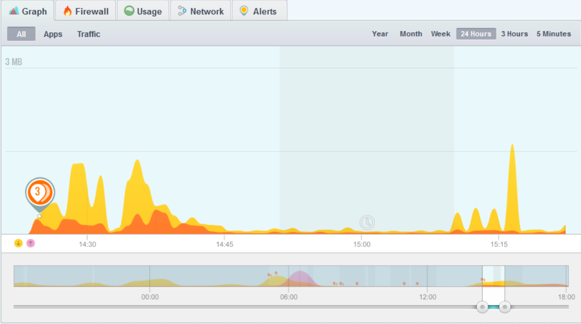
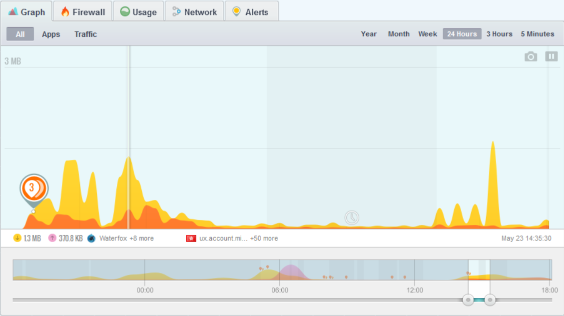
This becomes an issuing when I click on the graph to view the bandwidth data. I then have no x-axis scale for the data I am looking at. Instead I can see the bandwidth data and the time (mid-point) for that data:
If I want to click on a different time, there is no indication where a particular time is so I have two choices:
Guess and click until I find the right time.
Unfreeze the graph to display the x-axis scale and then click.
I can see why it might be a good trade-off to lose the scale so the bandwidth data can be displayed without having to leave a blank line free for this purpose. But I would prefer to always be able to see the x-axis time scale.
This issue won’t arise for many if not most people because the sliders are set to maximum by default (except for the 5 Minutes view) so the slider graph will mostly have the same x-axis scale.
Thanks for your feedback. We’re actually working on a mobile version of GlassWire now that is more about data counting, and perhaps we’ll learn some things to make the graph where it’s easier to use after we release that Android version, then we’ll come back to Windows to make changes at that time.
Remah, not trying to contradict you, but I’m not sure why this is a problem (despite your explanation). When you select a point to examine, yes the X-axis is scaled for the slider period, but you have the detail of the height of the usage where you stopped the traffic flow displayed below in the data bar. Isn’t that actually better than the approximate x-scale?
It is a relatively minor issue. In a perfect world, there wouldn’t need to be a trade off that hides the scale. I don’t expect that many users would run into this issue simply because they won’t be looking at the graph data in any detail.
The current situation would be fine if I was only ever looking at one data point at a time. It only became a problem when I was looking at many data points. I was looking at specific time intervals so it became annoying to have the scale hidden because there was no assistance as to where I needed to click next. That meant a lot of additional clicks a bit like trying to pin a tail on the donkey.