-
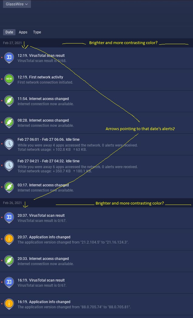
Alerts Tab: When the alerts are sorted by date, it would be a big plus to have the date line be rendered in a contrasting, brighter color from the background. Additionally, it might also be useful if there were a small arrow at the end of the date line text that points towards the alerts referenced by that date (either up or down, depending on the date sorting order).
-
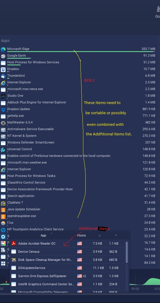
Usage Tab: It would be more useful if the items in the main columns on that page were able to be sorted in the same ways that the additional items from those columns can be sorted in the small dialog accessible from the “More items” button at the bottom of each column. Alternatively, the items in each of the main columns could be combined with the items in that column’s small dialog, thus allowing sorting on all of the displayed data using the several sorting orders that GW currently offers. Also alternatively, the main columns could be made scrollable so they could display all data items as well as them offering all of the sorting orders on them. That solution might mean not using the small, “Additional Items” dialog.
Thank you for this very cool program!