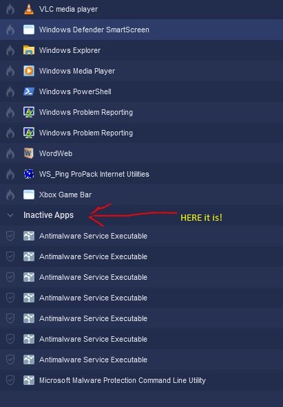
A while back, I suggested that the readability of the Alerts Tab when sorted by Date, would be greatly improved if the horizontal lines depicting the border between groups of dates were shown in a brighter and more contrasting color than the surrounding lines. Similarly, I think the Firewall Tab would also benefit from a more visible Inactive Apps line color and/or a larger font size. Currently, to be able to delete inactive apps, I find it is a bit tedious to have to search for the Inactive Apps line. A brighter or more contrasting color and/or a larger font size would make finding that line much easier.
1 Like
Thanks for your feedback.
Our team will review this, but please note there can be some limitations on UI changes due to the SDK we use.
Also, for anyone else reading this who is new to GlassWire it is possible to make our UI larger. Go to the top left menu and choose settings/appearance to make our overall UI larger, along with making our fonts larger.
1 Like