(I mean the thing that opens when you click on the icon of an app in the sidebar of the Graph view and in a bunch of other spots)
It’s pretty small if you have a big screen and it would be very useful to get a better overview if you could make it bigger, scrolling through so many items in a small window can get confusing.
1 Like
@Thinking
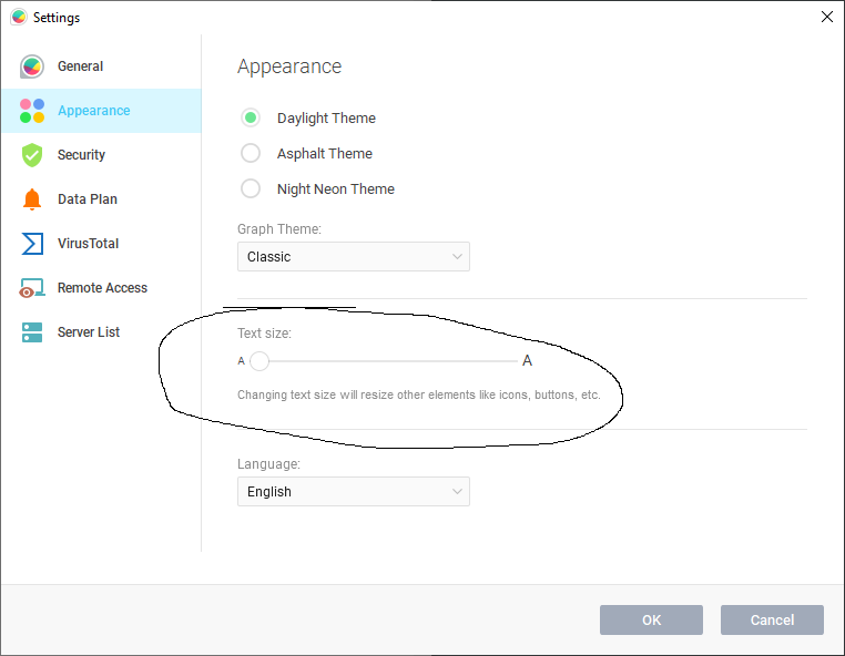
We added a way to make our entire UI larger awhile back. A lot of people don’t know about it. If you try that, does that help?
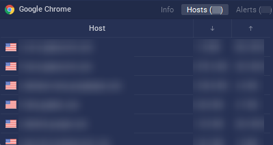
My problem isn’t that the text is too small but the box where the text is inside is, regardless of Text size (I just tested it) the maximum amount of hosts displayed while in the “hosts” panel for an application is 5 and a half (the 6th is cut off in the middle). It would be nice to be able to see much more than that at once without scrolling, it would be even better if there was an entire rezisable pop-out window just dedicated to info about the hosts an application connected to, the traffic type and other metadata. But just being able to see more than 5.5 hosts at one time would already be a great improvement.
For reference: this view what I’m talking about:
@Thinking
We are working on a “cards” system that will go with our search feature. I hope the “cards” will solve this issue for you and increase usability/readability.
1 Like