Thanks for your feedback. We will try to improve the usability in 2.0 (which will be a free upgrade for you in December).
Our Android app has a dark theme and we hope to do the same for Windows someday. Unfortunately it’s a bit more complicated for Windows due to the technology we use for our user interface. Thanks again for your feedback and kind words.
Hello, I loved the app and bought it in just 10 minutes after I’ve used. But same problem is affecting me, too. Version 2 is out, any ETA when will be able to set font size or background color? Thanks!
@msc1 and others, can you give some examples of other applications you use that change font/size and background colors a lot? It will help us understand how to implement this better.
Yes, you can download NetWorx V5.5 (V6 is not free) but that’s not the only issue though. All the colour palettes for mini graph are pretty bad UI/UX choices.
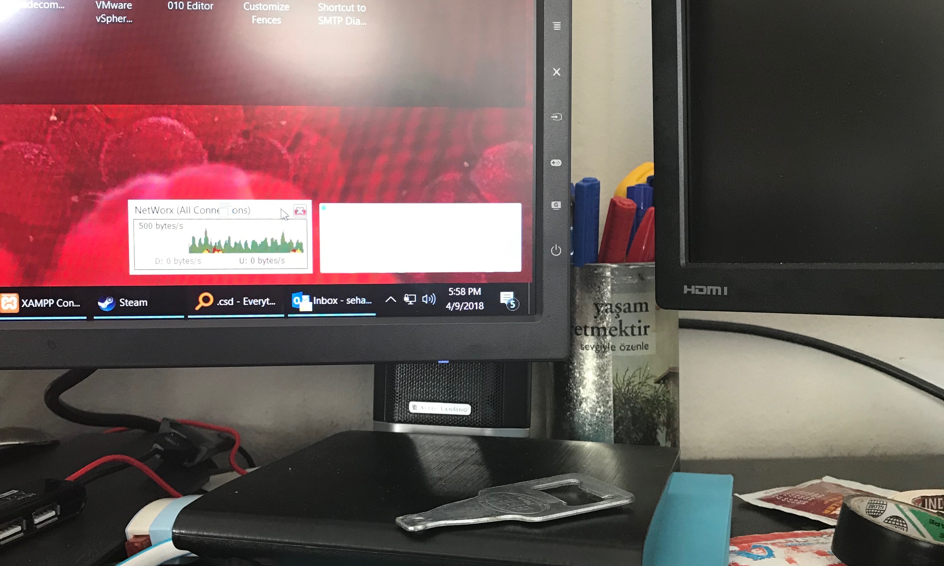
Monitor: 2160x1440p IPS Screen
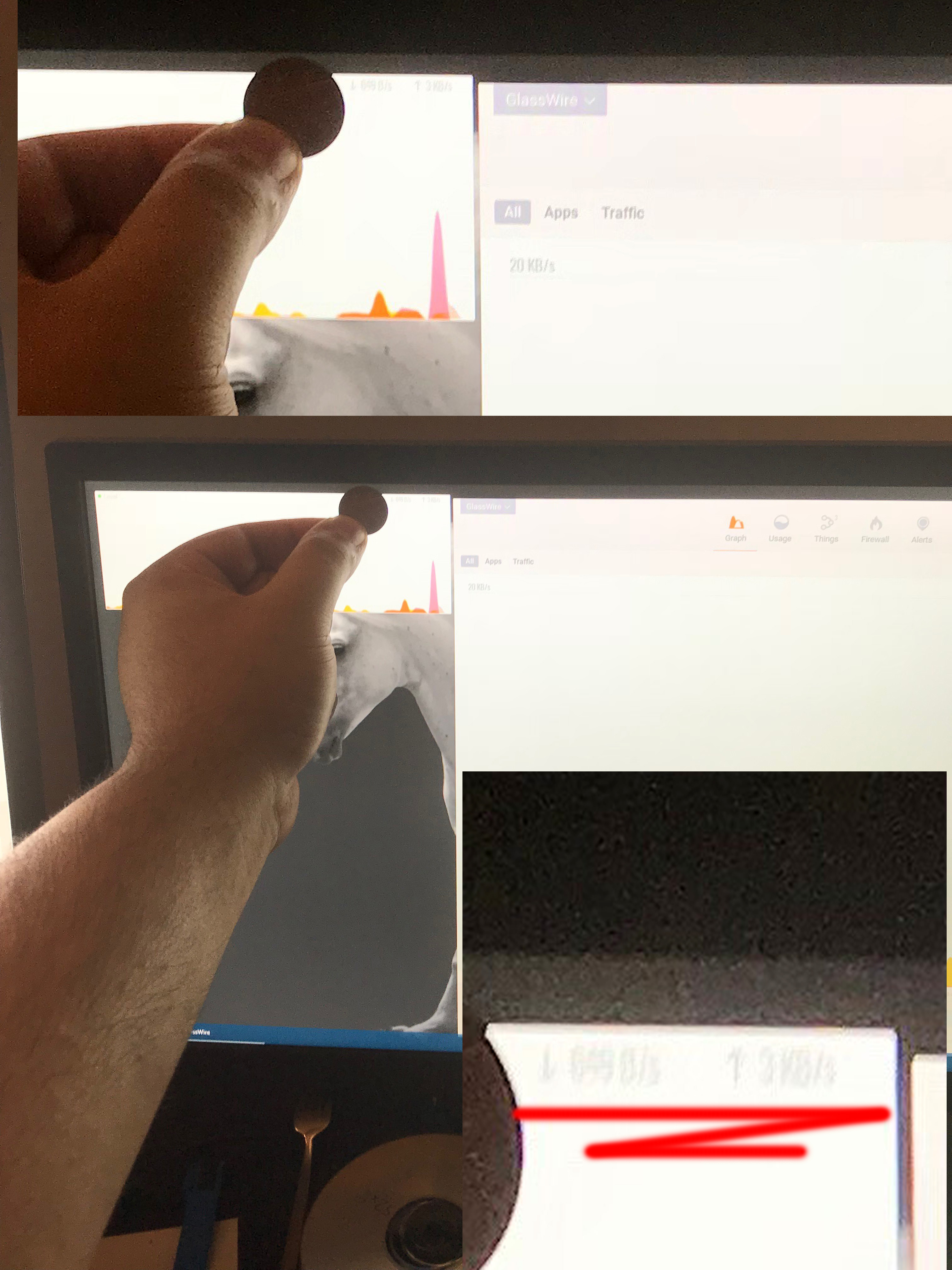
Photo taken with iPhone 7 from one arm distance and cropped for privacy.
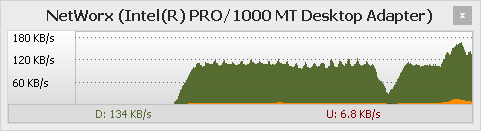
Hello, I haven’t received a reply. As an IT professional myself I don’t know any API that limits a developer to pastel colours and tiny fonts. If i squint real hard (I’ve 20/20 vision) I can make out few numbers but it could either be 10 kb/s or 10mb/s… There’s no scale of the graph either, it’s computer science 101; every graph needs an unit scale to show what it is representing. This and tiny font issue must be fixed ASAP. Please look at the font next to 1 penny, it’s absurdly small from viewing distance
Thanks for your feedback. We are actively working on readability improvements everywhere.
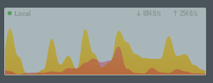
Is your mini viewer set to transparent? Click the settings icon when mousing over the mini viewer to see. That could explain why it’s difficult to see.
We show the incoming/outgoing bandwidth on the graph so that’s better than a scale in a way. Please note my mini viewer is set to be transparent, so that’s why it looks even more difficult to see than yours.
The mini viewer is supposed to be something you can glance at to get a general idea of bandwidth usage, and click to access the main graph so that’s why it’s a bit sparse. I see your points and we will continue to gather feedback and improve the mini viewer.